Art students are always told to study the masters, and to copy them. Coming from a journalism background, I was at first taken aback by this approach – it seemed at worst a kind of plagiarism, and at best an exercise that would stifle originality.
But once I tried it a few times, I realized that it is a way to train your drawing hand kinesthetically. Visual copying allows your hand and eye to work together directly, without as much thought interference as when you try to draw from life, for example.
Last fall, I started playing with the notion of how I might copy the masters in fused glass. A different kind of learning.
Masters like Wassily Kandinsky relied purely on shape and color to communicate, without even suggesting anything figurative. To take an abstract of Kandinsky’s and convert it to the medium of fused glass, I would have to absorb myself completely in those shapes and colors. I felt this could give me a visceral sense of the original artist’s intent.
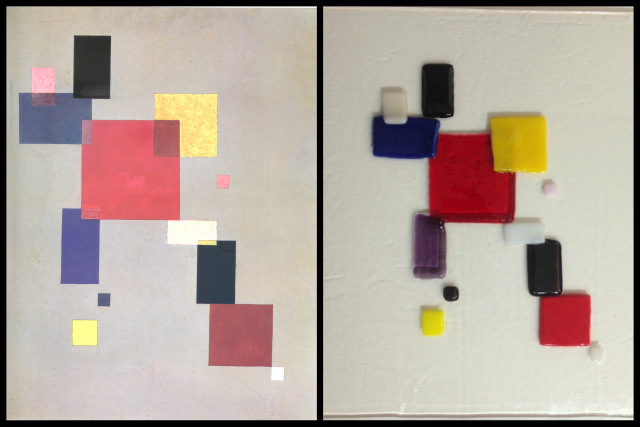
Kandinsky’s 13 Rectangles was the natural one to start with, since I love it so much and have played with it conceptually. Rectangles are easy to cut in glass, and the color matching would be part of the study.
I also expected to learn from the placement of the rectangles. How do the sizes, orientation and spacing play against the colors to strengthen the composition? Because glass is a 3D, not 2D art, how would the physical layers of glass affect the overall sense of the piece?
Last week I chose, cut and laid out the design. I did it on clear glass so that I could test how the piece might be affected by different background colors.
One difficulty was the physical overlap of two pieces of glass. In order to retain the square edges, I needed to tack fuse the pieces in the kiln – firing them at a lower temperature. If I’d done a full fuse, the squares would have melted together and lain flat, but they would have lost some of their shape.
You can see the results of this test piece in the juxtaposition with the original painting, above. There’s a bit of droopiness at the edges of the overlapping rectangles, but for the most part I think it worked out OK.
What was hard to capture in a photo is that, in glass, the piece feels very animated. The colors pop, and the reflected light adds a dynamic quality.
The colors aren’t a perfect match to Kandinsky’s oil paints, but I tried to capture the sense of the colors and their qualities. Glass has limited choices compared to oil paint, and Kandinsky seems to have taken liberties in his overlapping areas (a strong red and dark blue don’t make pink or lavender, for example).
The pink that I used in the upper right washed out upon firing (it was pinker in the original); and the mud-red that I chose for the lower right square lost some of its brown tint in the kiln.
The more important mismatch was that I was off on the values. Look at this comparison in greyscale:
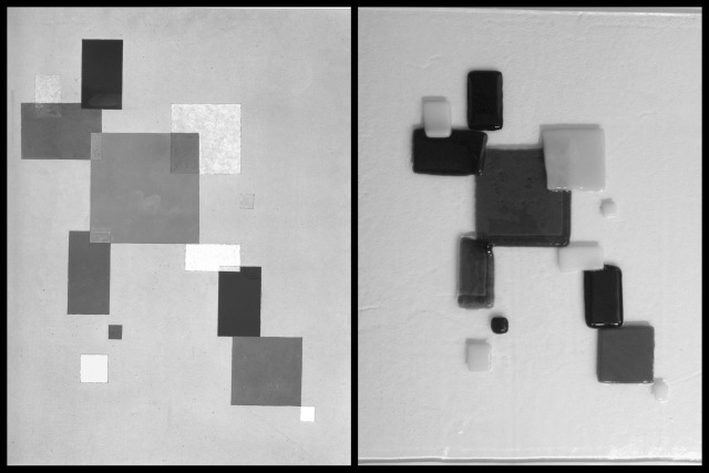
Kandinsky’s piece encompasses a rich range of values. My glass version, though it has five values, doesn’t exploit the full subtleties of the scale.
For my next test, I’ll try to choose the colors with more thought to the values. As this would make color matching even more difficult, I might choose strictly based on values instead of color, and use different colors entirely.
I would also like to try compositions that I came up with when playing with 13 Rectangles – a game using construction paper. Here is one from exactly one year ago today:
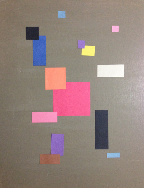
I’d do this a bit differently now, but I like the central “action” in the lower two-thirds that to me implies a figure running toward the viewer and out of the picture. Moving the upper left blue and black rectangles further up and out might work better.
That’s when it starts to become my piece, one that isn’t a mere imitation.
Today’s penny is a 2015, the year I fell in love with 13 Rectangles.
A penny last week was about taking art lessons … busy with Oktoberfest and cartoon deadlines, I didn’t have a chance to comment. Reading about you learning from Kandinsky reminded me that I wanted to tell you that my most rewarding efforts to learn to draw were during a period from 1970 – 2004. During that time I traveled throughout North America and Europe on business unrelated to art. I traveled with sketchbooks. During business downtimes I visited museums and galleries to sketch and take notes on works of art about artist’s techniques and styles. Today, I can shortcut the process when time is of the essence. For example, if I need to draw hands in certain positions I can call on Google and Pinterest to provide me with images for reference — https://www.pinterest.com/pin/318137161157484098/
Wow thanks Bob! All the good art teachers tell students that they should always have a sketchbook with them. You also had a formal art education didn’t you??