My piece from the first week of fused glass class was a square bowl, and it didn’t turn out well.
The transparent purple and the neon blue look odd together when fused. The gold threads were completely lost. All the colors are distorted by the surface beneath them, unless the bowl is displayed on a white cloth.
The sharp lines of the glass pieces softened, curved, and became indistinct; the purple shape that had looked like a slender pitcher became a vague sort of rectangle, puking garbage instead of pouring a frothy liquid.

Our pieces get a second round in the kiln for the slumping, which is when the glass is placed over a mold to give it a shape. The slumping on this piece left more of a divot than a bowl, so it was a square plate. The instructor offered to re-slump it, but it didn’t seem worthwhile, since the design itself was so bad.
My smaller fused glass piece, a dipping dish, didn’t turn out at all like I’d pictured, either.
I tried layering three squares in purple and white, at angles to one another, and then a circular dab in the middle to offset the angles. But the whole thing just looked like a big blob. The instructor said this was because I had used three layers of glass. Would have been great to know that in the design stage.
I thought I had made some progress last week when I created another bowl and a set of four coasters to match. I used French vanilla, a cream-colored opaque glass, for the background, with bright red larger pieces to anchor an alternating pattern of triangles and rectangles of sky blue and deep amber.
These colors and shapes match a set of Afghan carpets I have, and also a stained glass lamp that Dad made to match the carpets. I imagined the bowl and coasters on the table right under the lamp, in a happy aesthetic unity.
It was not to be. Today when I got the pieces back from the kiln, I was crushed by their ugliness.
The copper in the blue glass reacted with the sulphur in the French vanilla glass, and turned those pieces a dull black in the coasters and a hideous green in the bowl. The instructor said she didn’t realize I was putting the colors directly on top of the French vanilla (though we’d had a discussion about whether the cream or clear piece should go on top). Another lesson after the fact: This was the first mention that French vanilla would have such an effect on colors.
My abstract patterns looked random, incoherent, like something a kindergartner would do, or perhaps worse. I thought I knew at least a few principles about what makes an abstract work, but my design was not evident when the glass was fused.
I left all five pieces in the classroom and told the instructor she could do whatever she wants with them. She said they could be shown as a demonstration of how French vanilla affects colors. Lucky future students.
She offered to let me come in to make another set next week, but I just don’t have the heart. I went out to my car and wept with disappointment.
My creations are so unlike my visions.
The ugly purple bowl-plate has had a miserable couple of weeks, shuffled from dining table to breakfast nook, making me feel worse every time I looked at it.
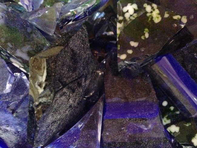
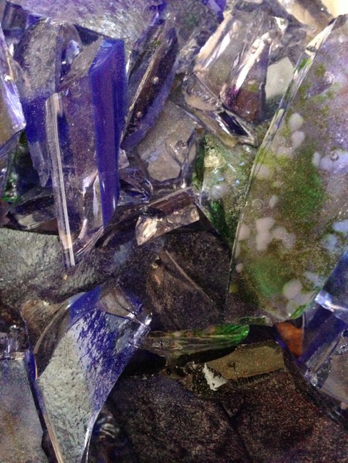
Today I took it outside in a paper bag, threw against the asphalt, and then smashed it repeatedly with a hammer. It was a great relief. It felt a lot like being a teenager again.
When I opened the bag and stuck my iPhone in to take some photos, I saw it: the real beauty.
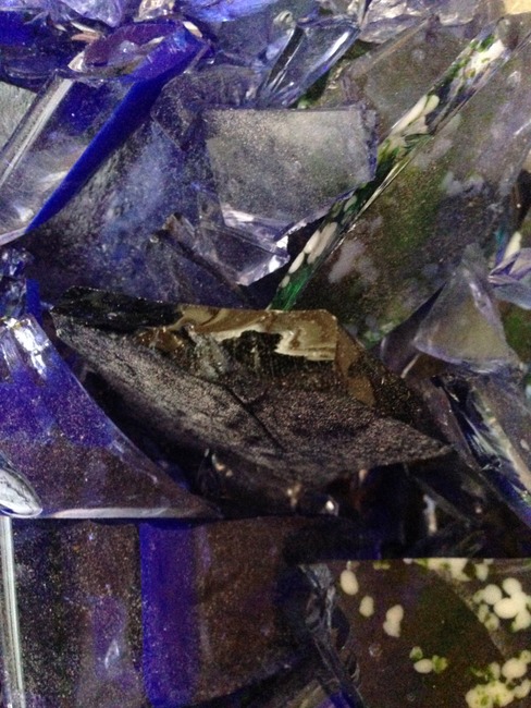
The glass is inherently beautiful. It is much more beautiful in pieces than anything I have created from it.
I don’t have much in the way of artistic skill. My gift is seeing.
I see beauty everywhere.
Day 114: The penny is a 2015.
