When I browsed my Kandinsky book this morning, his painting Accent in Pink jumped off the page to embrace me.
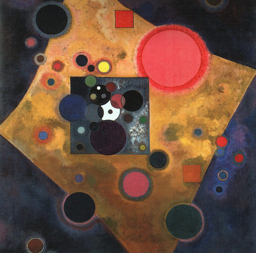
The diamond-shaped rectangle stretches its “arms” wide and reveals the energy emanating from the center. The energy take on many colors, black, dark green, three shades of blue, gray, pink, red, emanating from a mottled gray square at the center.
Like the Source, which belongs to the being and to the universe around it, simultaneously.
The white circle in the middle acts as an anchor because of the purity of the white and its brightness. The light seems to come from behind this white center and illuminate the top of the painting.
The large rose pink circle, with a reddish orange aura, is positioned as though a heart. It seems to throb rather than move outward, and unifies the composition. Two squares, orange and reddish orange, also provide anchor points at the edge of the figure, as though holding open a robe.
The central diamond shape is animated by its curved edges – a shape I often use in fused glass for that very reason. Its mottled coloration is a glowing mix of wheat-toned gold and tan with hints of pink, blue, yellow, beige and green.
The background, too, although predominantly very dark, is a mix including pink, blue and violet with hints of an underpainting that includes yellow and green. Its daubed style matches the central gray square, a portal through which life can flow.
Warm and cool colors both add to the effect; but in this painting, warm and cool are so relative and so muted, especially in contrast to the diamond figure, that their specific color hardly matters. It evokes an energy that does not judge.
The Source comes through everything and animates everything.
What do you see?
Today’s penny is a 2001, the 75th anniversary of this painting, the year the Twin Towers fell.
To view the full painting, visit the Wikimedia page.
I see Joy — Ann
🙂
That too